Folio and Paper: two new booking page themes

2. listopadu 2026 · 4 min čtení
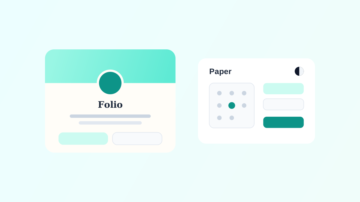
Until now, Tymeslot had two booking page themes. Quill is a frosted card over a background image or video. Rhythm walks the visitor through one step at a time over a moving background. Both put a lot of design between the visitor and the booking, and both assume the visitor is ready to pick a time the moment they arrive.
That is not true for everyone. A coach's client usually wants to know who they are booking before they choose a date. A team that puts the booking page inside its own product wants the opposite: no personality at all, just its own colours and a form that works.
So we started each new theme from a person rather than a look. Folio is for the first case, Paper for the second.
Folio: the page that introduces you
Folio is for coaches, therapists, consultants, writers and freelancers, people whose booking page is in effect their homepage. Visitors arrive from a profile link and want to know who you are before they book.
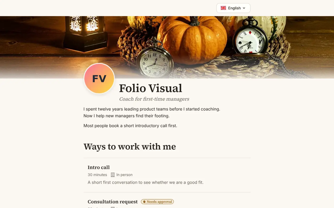
The page opens with a cover image, your portrait, your name, a one-line headline and a short bio. Below that, under "Ways to work with me", each meeting type is a full-width entry with its length, where it is held, its price if it has one, and its whole description.
It is one continuous page. There is no Next button and no step to go back to. Each section opens below the last once the one above is answered: the meeting type, then the length if the type offers several, then the calendar, then "A little about you" with your questions one at a time and the form. Once a type is chosen, a bar with your portrait and name follows the visitor down the page and jumps back to any section.
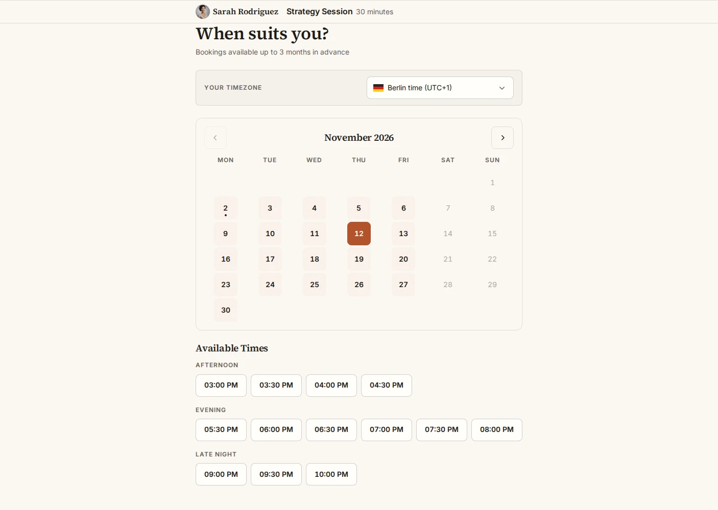
Folio speaks in the first person, the way your own website would. The calendar asks "When suits you?", the button says "Book our session", and the confirmation reads "See you on Thursday 10 September 2026, Mia".
You can choose one of six colour schemes (Ivory, Sage, Harbour and Blush are light; Dusk and Ink are dark) or derive one from your own colour, one of four font pairings with serif headings, the corner style, and a cover from seven presets or your own upload. The headline and bio come from Profile Settings, which now has fields for both.
Paper: the page that gets out of the way
Paper is for the opposite case: someone coming from Calendly or cal.com, a team that white-labels its page, an organiser whose own brand comes first. Their visitors want to book and get on with their day.
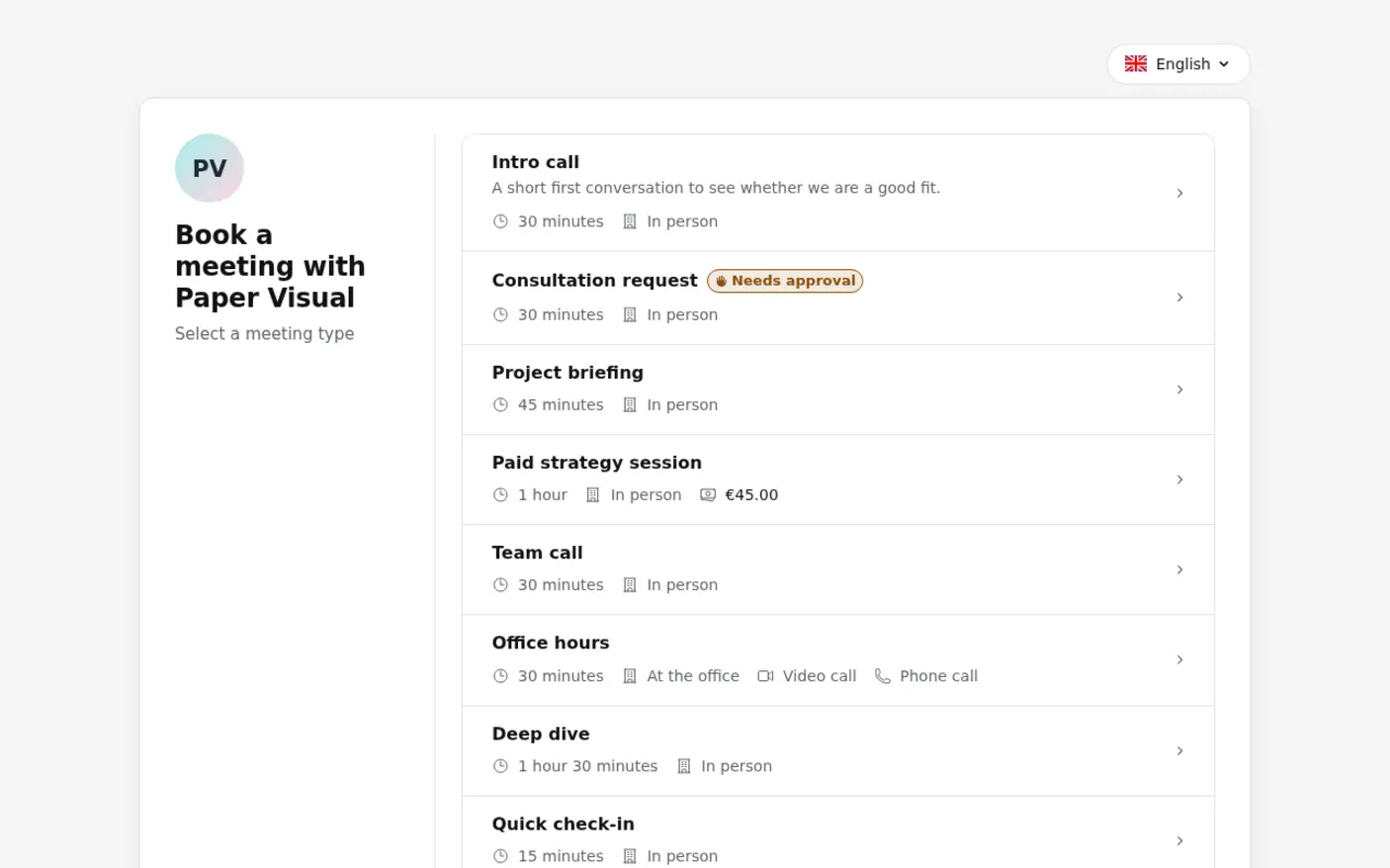
Paper is one flat card on a plain background, with no image, video or glass behind it. It has two screens. The first lists your meeting types; choosing one goes straight on (a type that offers several lengths asks which one first). The second holds the calendar. Once a time is picked, the details follow on the same screen: your questions, all at once, where to meet, the form and a single "Confirm booking" button. "Change time" brings the calendar back without losing what the visitor has typed.
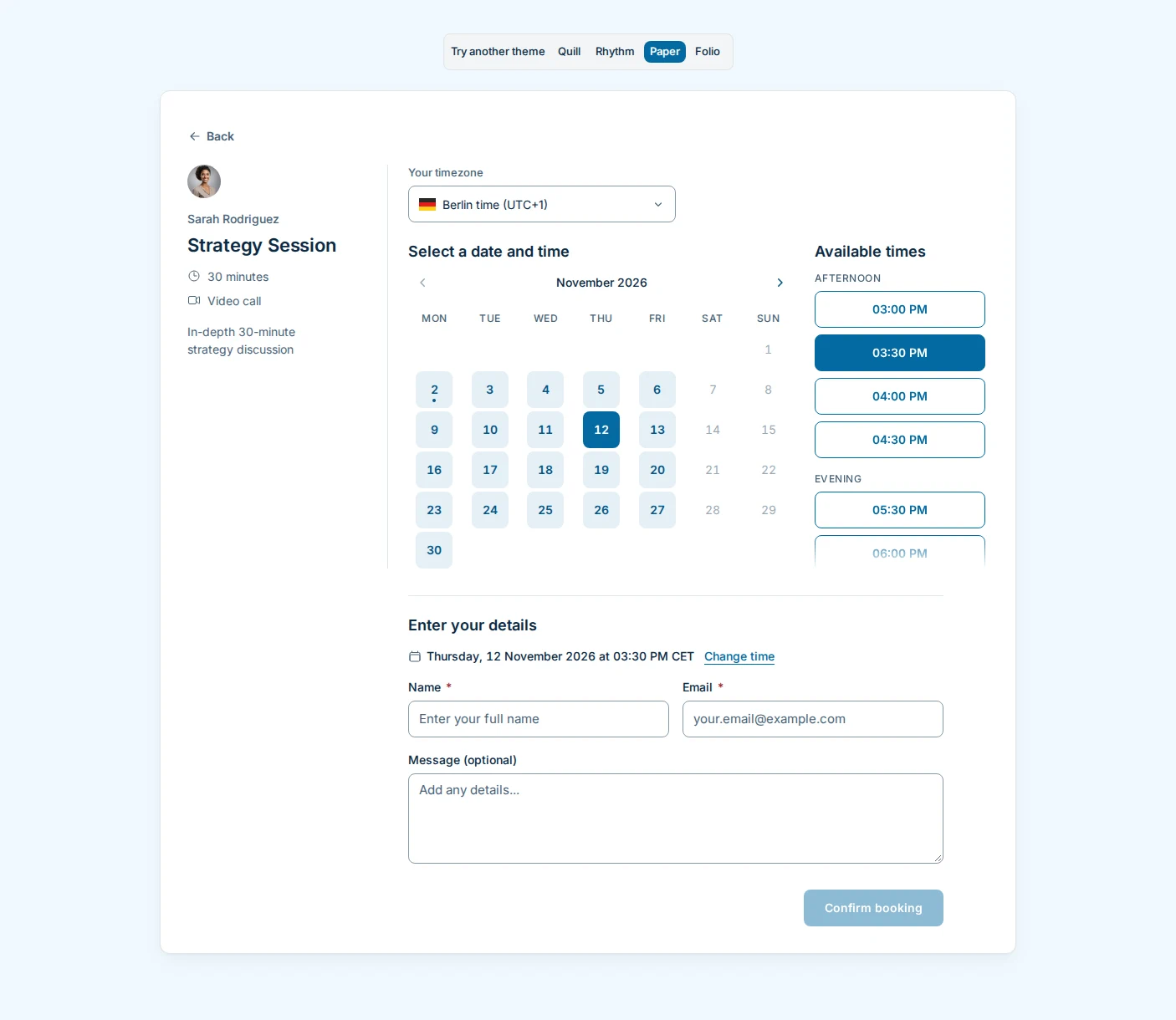
The wording is plain and short: "Select a meeting type", "Select a date and time", "Booking confirmed". No greetings, no exclamation marks.
You can pick one of eight colour palettes or derive one from your own colour, and set the page to light, dark or the visitor's own system setting.
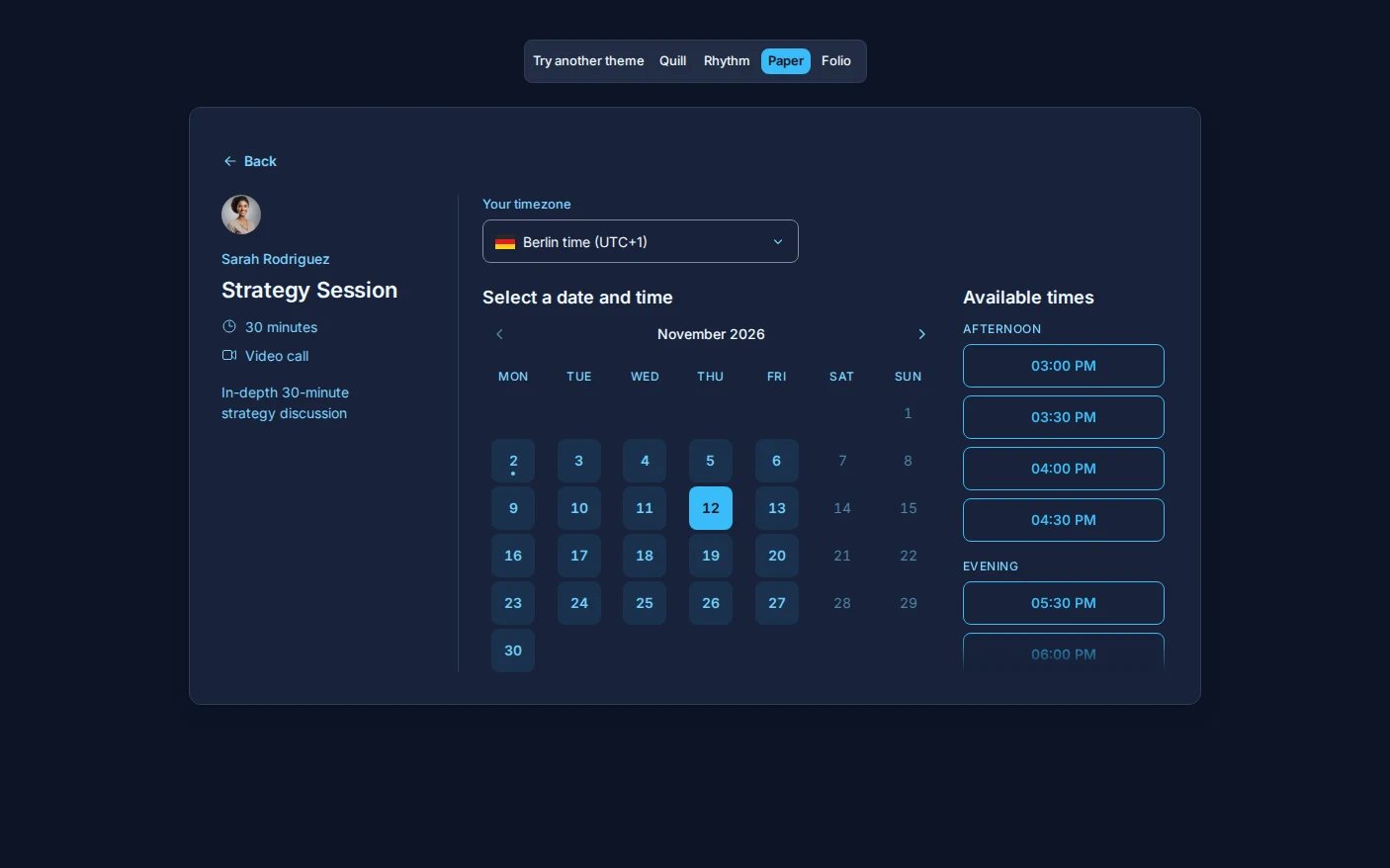
There is a choice of three fonts (the system font, Inter or IBM Plex Sans), the corner style, a month calendar or a week of free times on one screen, and your logo in the card's corner.
Trying them
Open Theme in the dashboard and preview either theme on your own booking page before you switch. Nothing changes for your visitors until you choose it. Both themes handle paid meeting types, group bookings, booking questions, bookings you approve and rescheduling, as Quill and Rhythm do.
If your booking page is where people first meet you, try Folio. If it should be as quiet as a form, try Paper.